Air Europa In-Flight Portal
Design for an offline in-flight portal, available while on board of the aircraft. Not all airplanes have an internet connection on board: this portal is aimed for airplanes without it and available over local ethernet when user simply connects over WiFi.
Know the User
The airline’s passenger mostly travels for Vacations/Weekends (60%), Business (20%) or Visiting friends and family (20%). The vast majority of passengers comes from Spain, UK is on the second place. The most commonly used device in Spanish market is Android (90%). Note that population that travels is a subset with more financial means.
According to the web traffic statistics from July and August 2017, the most popular screen resolution globally is now 720x1280 used in many low-end and mid-range smartphones, Source: Device Atlas. The average Spanish consumer actually has a cheap phone and ranks between the developing countries in device usage.

We can estimate (even if no official stats are available), that majority of users access the in-flight portal does so via their mobile devices, potentially tablets and not laptops.
The Plan
Besides being a really mobile-first website (not app), it also had some very specific requirements (mostly dev related), such as being available completely offline and therefore use only local files (no linked to third party or CDNs). The website would also update once the plane landed (to manage payments after every flight, and grab the news or weather updates daily or twice a day) as the tech “box” behind it had a sim card for ground connectivity.
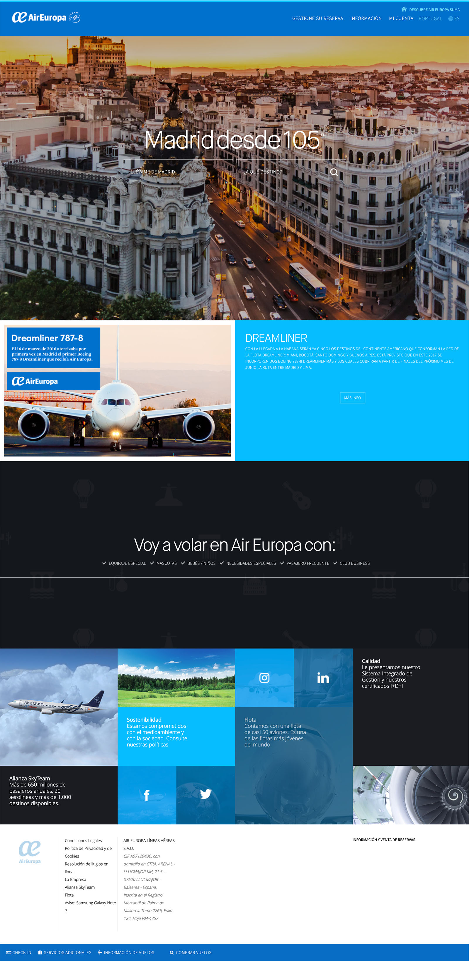
The UI styles are to follow brand guidelines (dark blue, white and light blue color scheme), font; with some minor for components/pages that haven’t been designed. Decision was also make to rely more on common Android design and UX, than iOS.
The Design Process
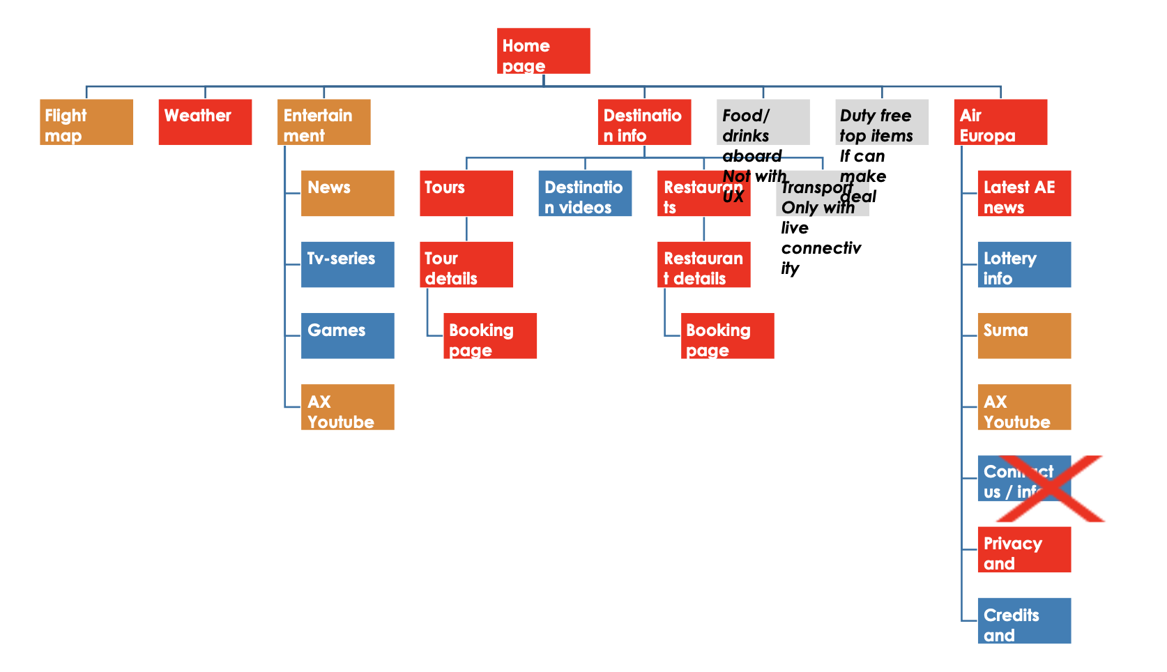
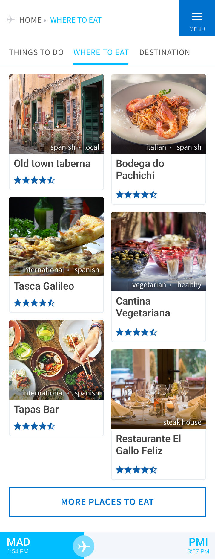
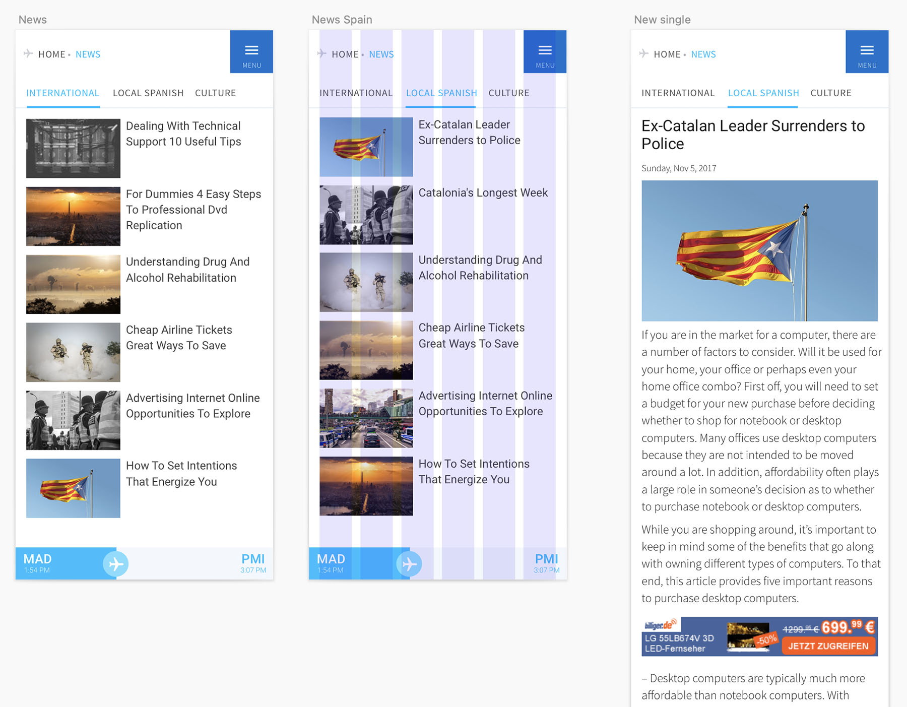
Even thou the main architecture was quite straight forward there were still many open options. The home page is a starting point for main five parts - Things to do, About destination, Where to eat, Weather and Flight info. Entertainment (news, games, videos) is secondary so user had to go thru menu to get there (no monetization there in the MVP, but ideally later sponsored content should be added).
Also a big emphasis on monetization was considered, as portal mostly bring revenues from advertising, sponsored content and integrations with activities, and restaurant reservations (and other behind the scenes things). Pretty much all bookings were handled over the email sequence once the user landed, for confirmation and payment. Yes, some conversions were definitely lost, but the company behind the project specializes in email marketing.
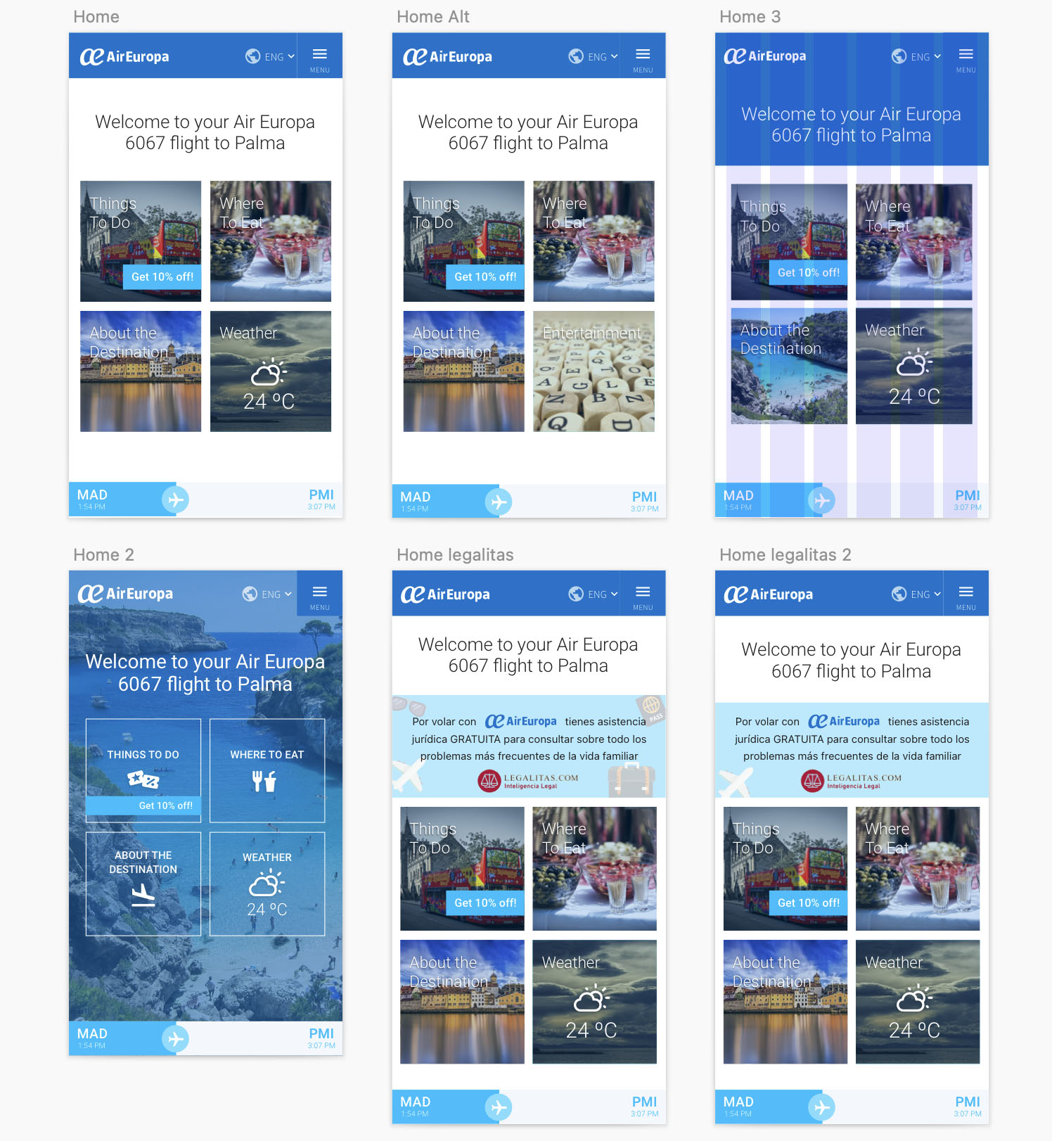
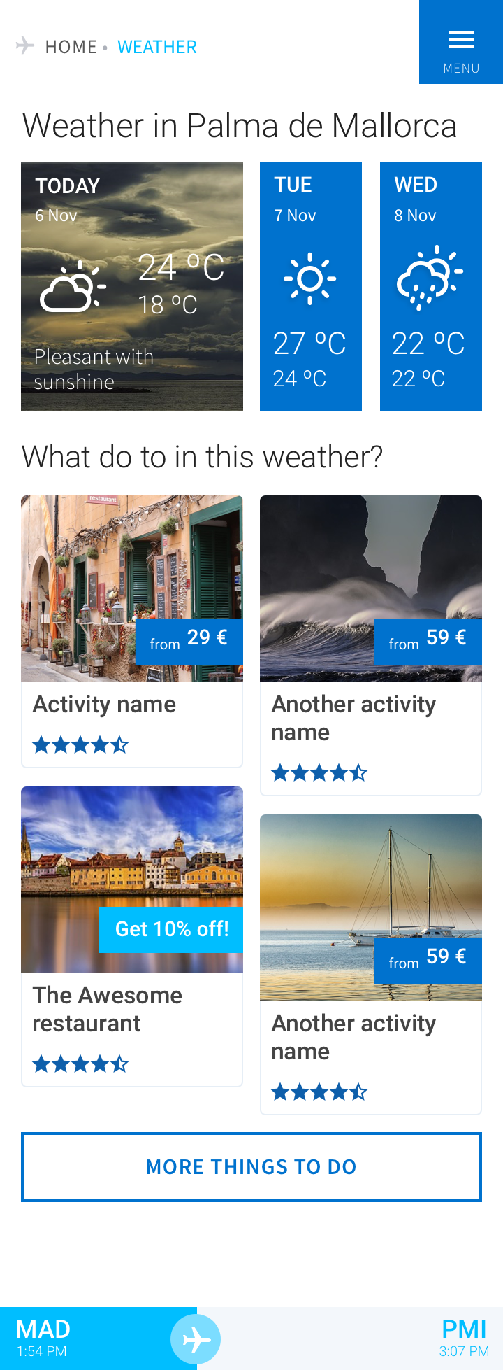
After the phase of rough wireframes (no screenshots here) and hi-fidelity wireframes, the part to join wireframes with the branding begins. This is the outcome of some parts for the in-flight portal, some still in variations to see what works better.
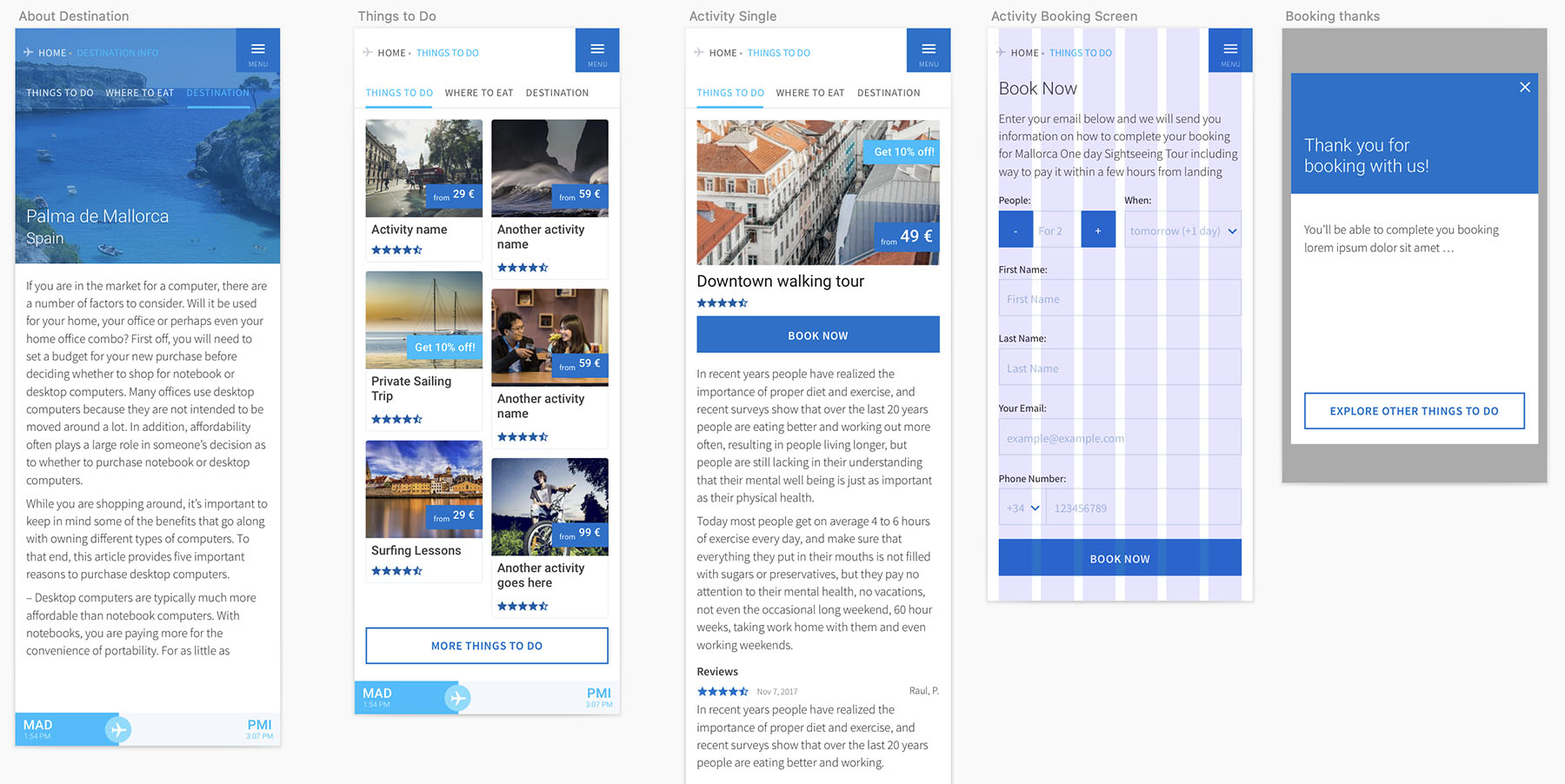
A different part was a flight tracker where the map and position of the airplane is provided by one of the softwares of the industry, with a basic data such as altitude, ground speed and distance of the flight.
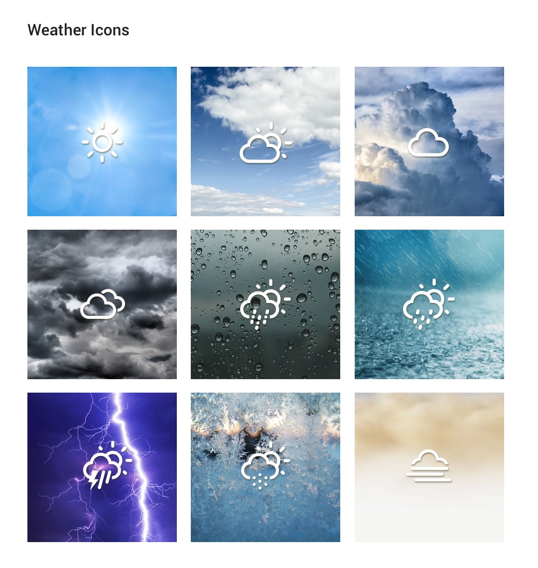
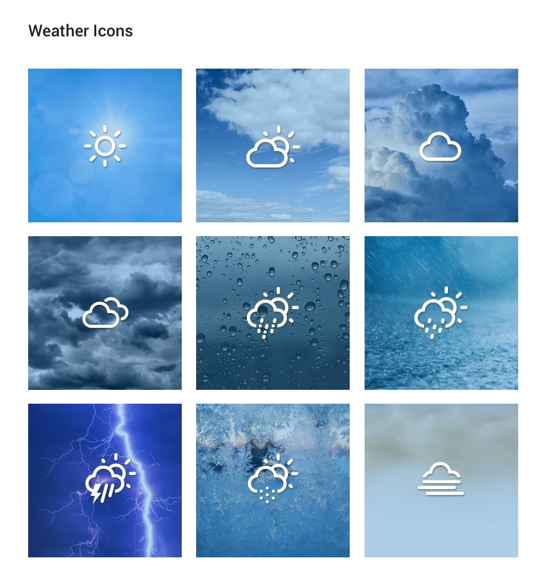
For some parts of the in-flight portal we went into the details, such as tinting the weather images to keep the blue branding tones. Not sure which one was locked-in in the end.
The Markup
Bootstap 4 with come custom scss, icon fonts (font awesome and weather icons) delivered as clickable prototype of html (with some js), using only local files; as handover to dev.
Finished Design Available in HTML files
Not going to share the files, but here are some visualizations of final product (in MVP stage).

