Scan Magazine Family, Editorial Online Magazine
From online directory to editorial magazine family.
Scan Magazine is a unique showcase magazine focusing on various regions – Scandinavia, Southern Europe, Benelux, Germany. It appeals to all those who have a relationship with or a connection to these countries – be it through family, business, tourism, migration or investment.
The Start
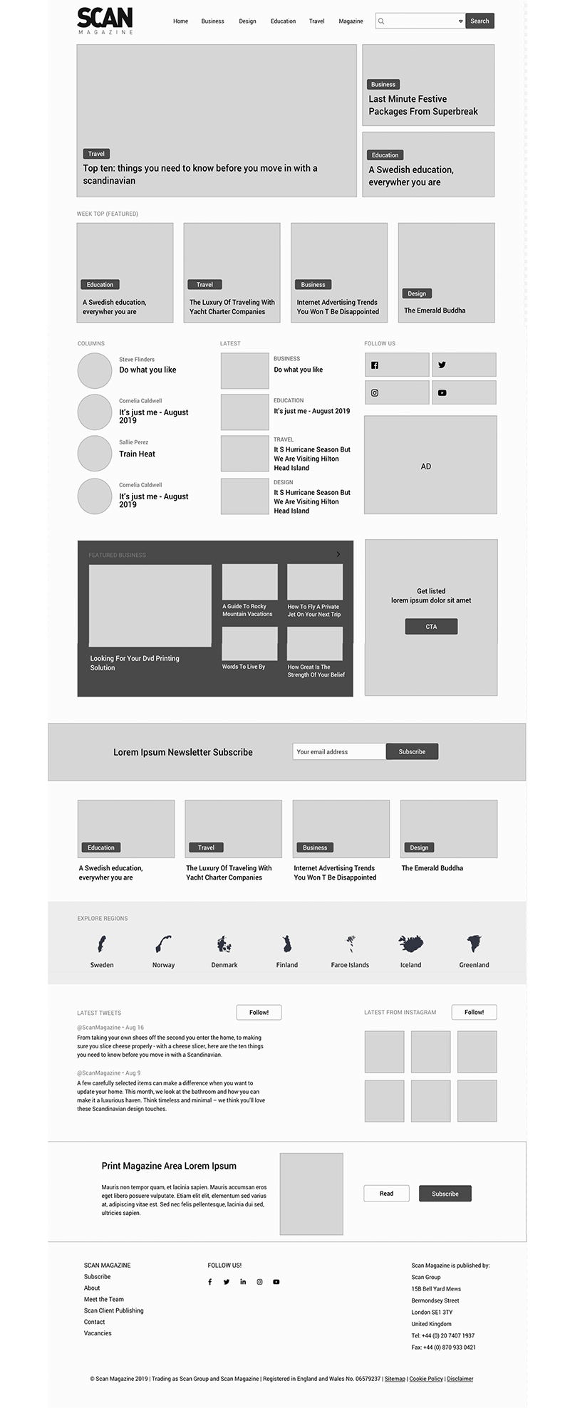
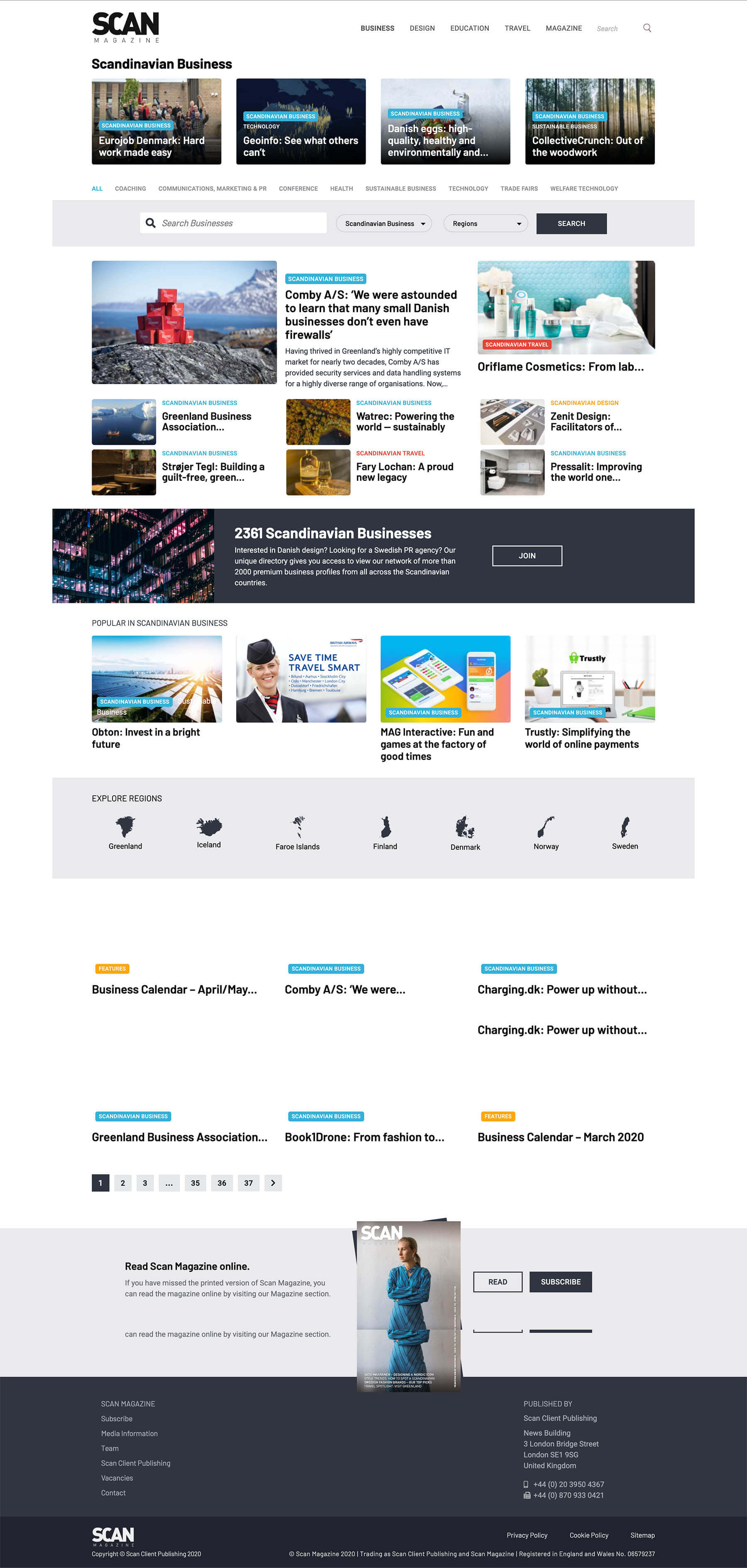
The initial online version was pretty much “a web directory” of different businesses and everything connected to the area. Maybe not even a directory; it was a bit of everything - a business directory (with featured profiles), a “download this free e-book”, a “read our printed magazine”, and editorial articles, categories and destinations were a bit more digged in …
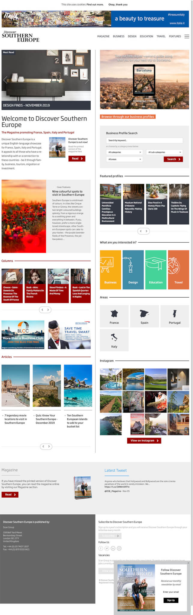
With the new version we wanted to turn into “editorial & news first” to move away from a directory and bring already published stories into the center of online version. Invite users to sign-up for a newsletter; keep space for advertisers.
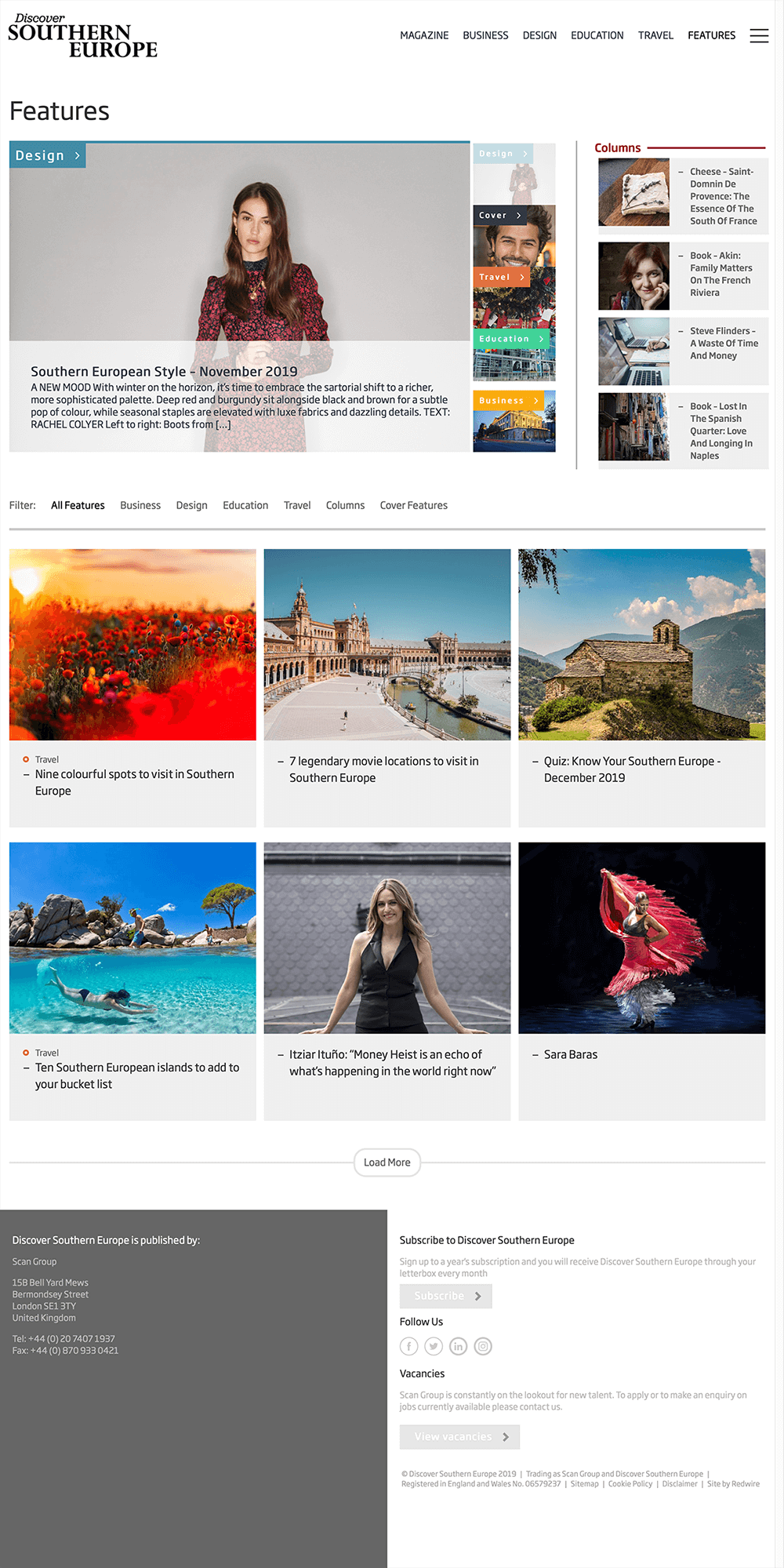
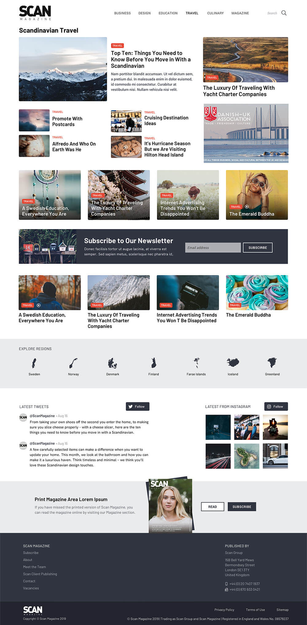
Initially, editorials were categorized into for categories - business, design, education & travel. Each also distinguished by it’s color.
The Process
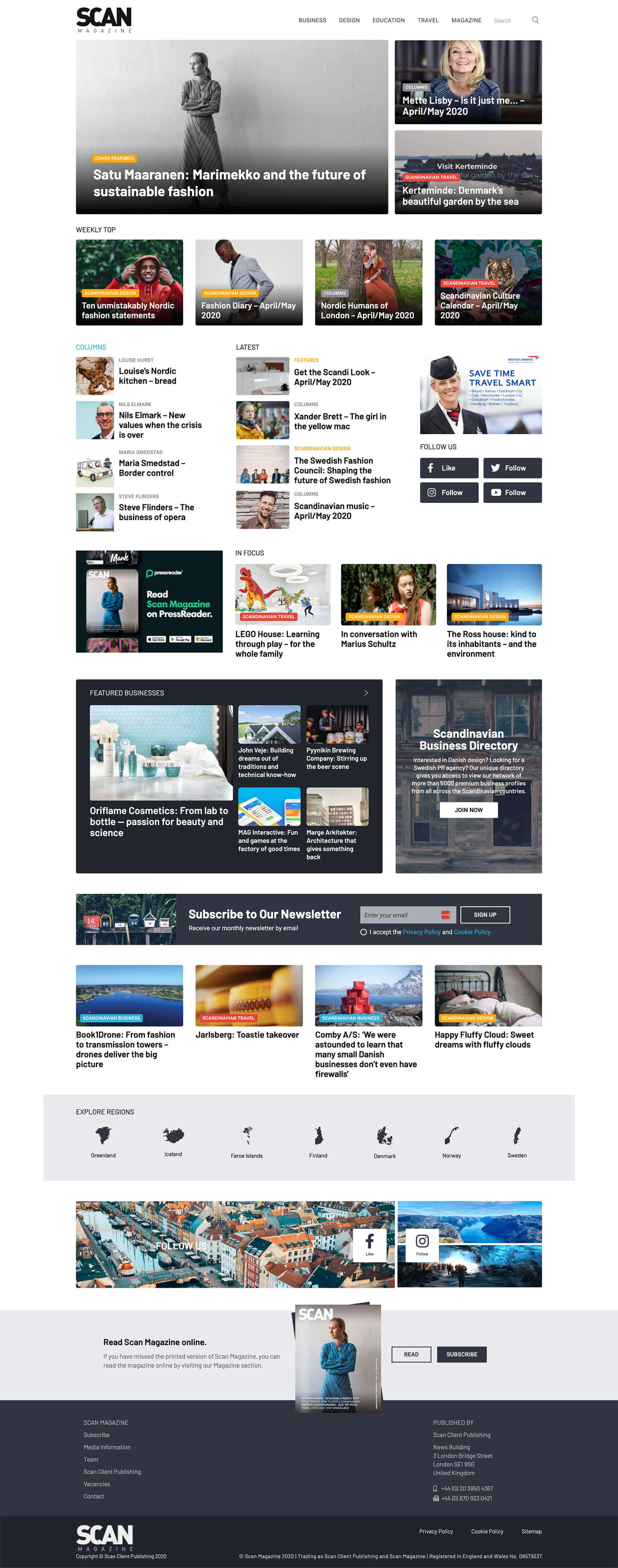
The categories and their colors were pretty much the only thing we wanted to keep; with the twist to the Business category, where finding a business in sector was still the main goal. The categorization per category (topic) and not destination was a main objective.
Design-wise, the new look was expected be more minimalistic, scandinavian, black & white so that images don’t get hidden in colors. With the only exception of color for categories. So, to not overuse the colors, only the category labels were colored.

The Process Again (2-3 years later)
While the first version was alive for a few years (with minor additional tweaks), and it was a big improvement from initial one (and the traffic grew quite a lot). There were still things that could be improved or have been “outgrown”. So …
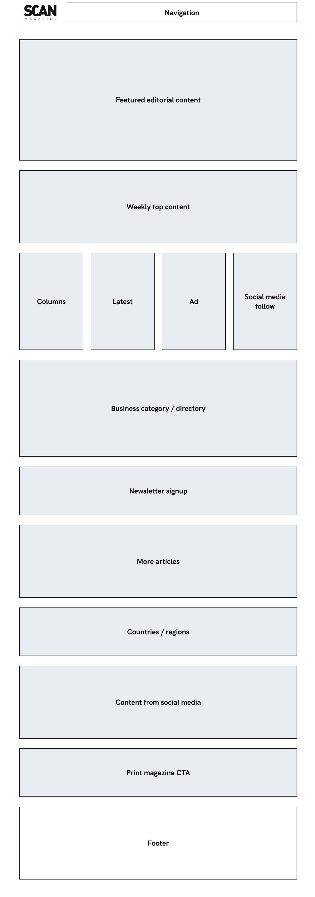
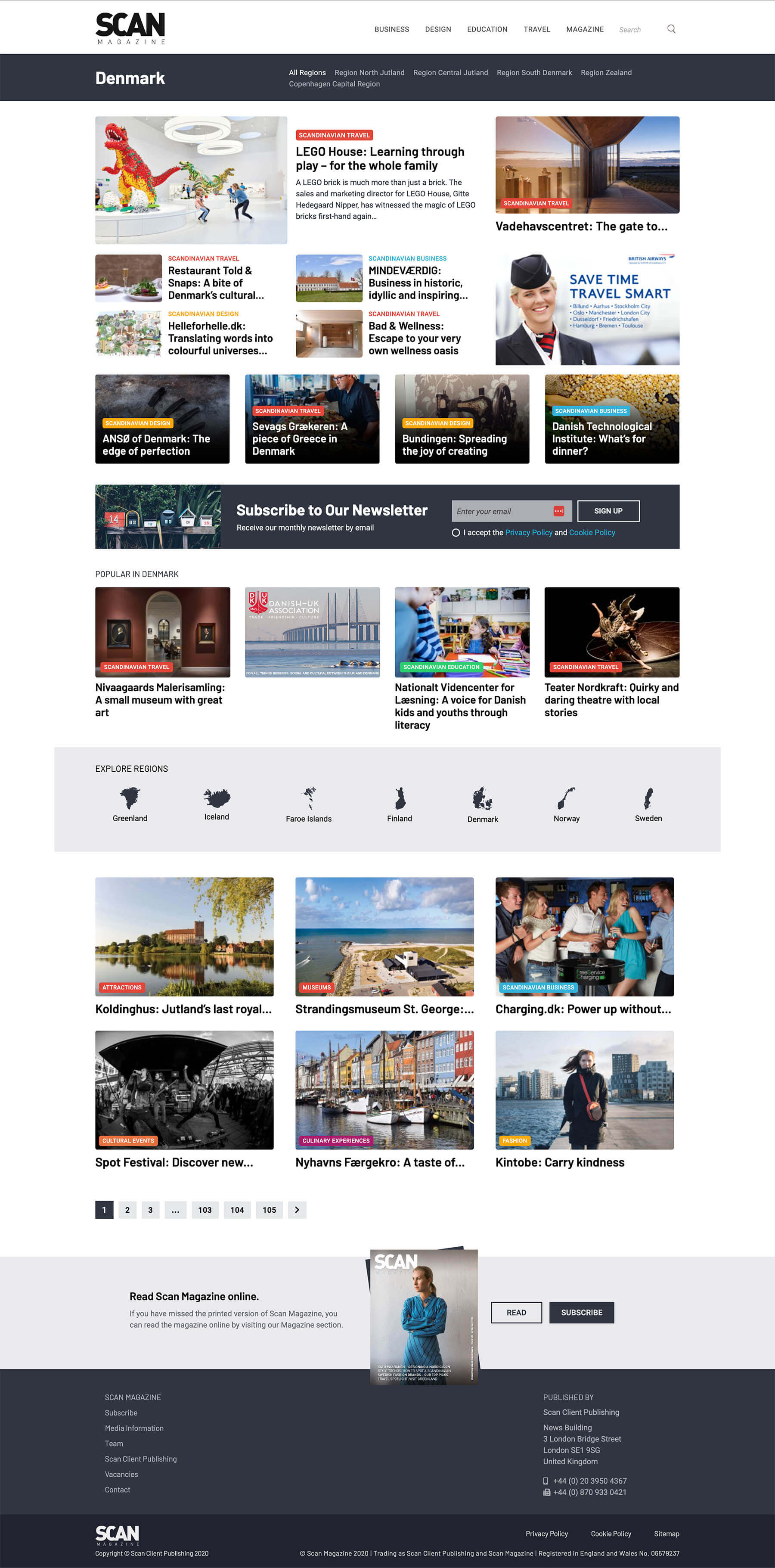
More importance was brought to de destinations (along the topics), so regions pretty much became part of navigation (or a second navigation).
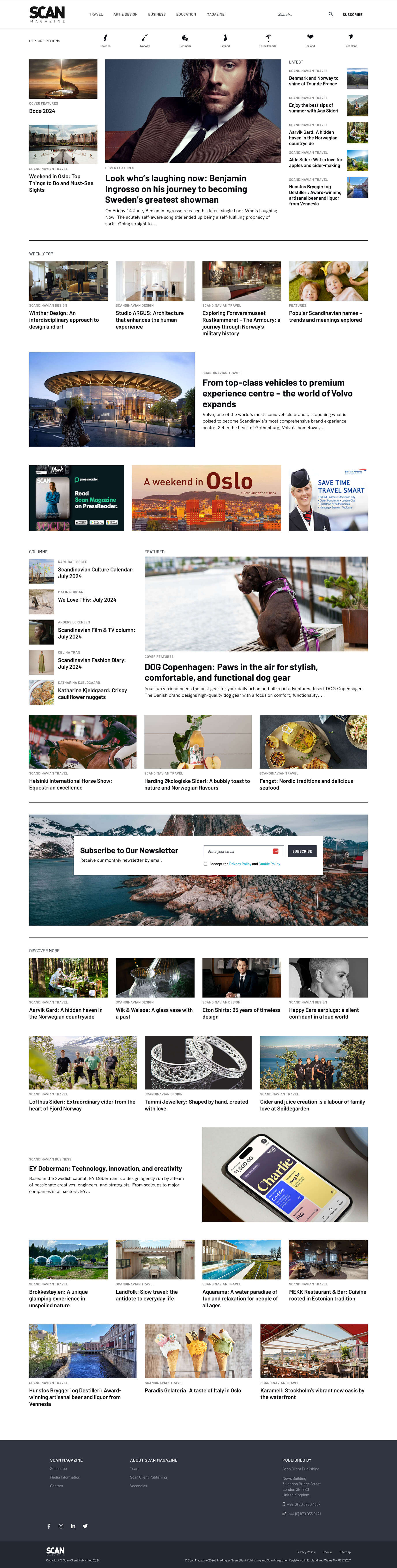
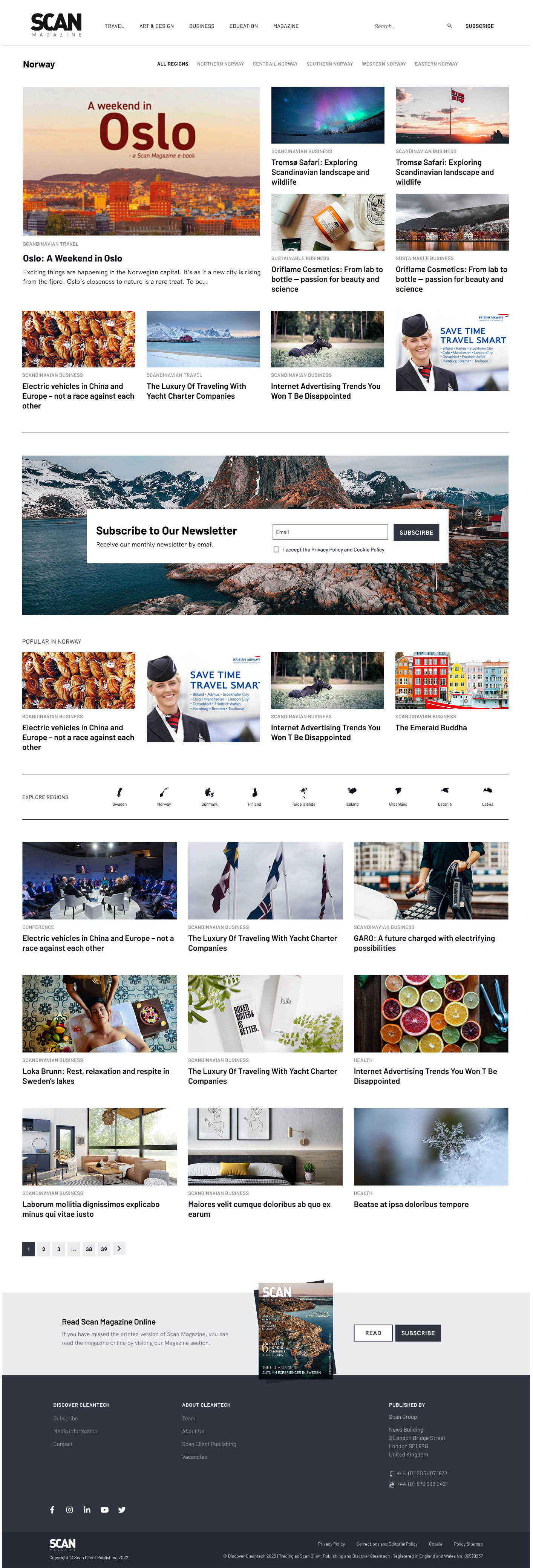
Featured news were more exposed (ie bigger), design was adjusted to more “scandinavian design” look with focus on photography, (& we finally got rid of initial colors for categories).
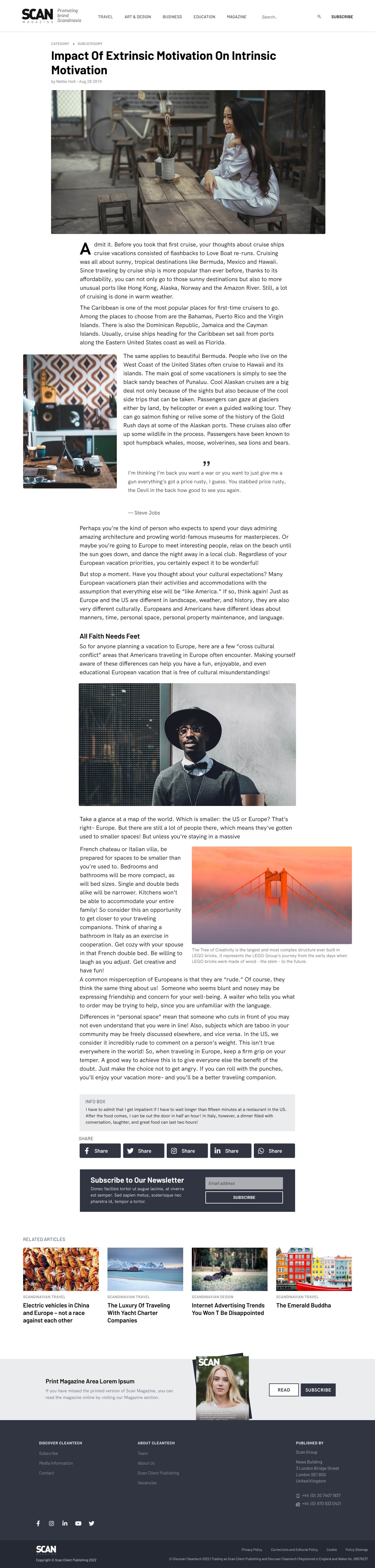
No more titles over the images. Also, the ratios of images were unified, which gives better rhythm to editorial pages.
One more website was added (Cleantech) - but this one purposely build with more colors and arranged differently from the other (destination) related ones.
The Result
Family of editorial websites for web and mobile, each categorized by countries & regions as also four main topic blocks.

ScanMagazine, Discover Germany, Switzerland and Austria, Discover Benelux, Discover Cleantech