Startdeliver – Customer Success with Impact
Startdeliver is a customer success platform designed to help businesses understand their customers, track health and retention, and act on the moments that truly matter. From KPIs and milestones to customer health trends and internal success metrics, the application brings large amounts of data together into a single, coherent view.
I joined as the sole designer during the early phase. The team had a clear vision and a long list of data they wanted to surface, but struggled with hierarchy, clarity, and the shifting priorities of different users. My role combined UX architecture with UI design based on the company’s brand guidelines.
Key challenges
The core challenge was structuring a lot of data in a way that felt meaningful regardless of what the user wanted to focus on — customer health, KPI trends, milestones, or segment-specific insights. Users also needed two different perspectives: a company-level view and a person-level view, each with its own priorities and indicators.
UX approach
I worked through multiple iterations and explorations to find a system that balanced global overview with deep-dive detail.
Key decisions included:
-
Clear data hierarchy — sequencing information into primary, secondary, and tertiary layers to prevent cognitive overload.
-
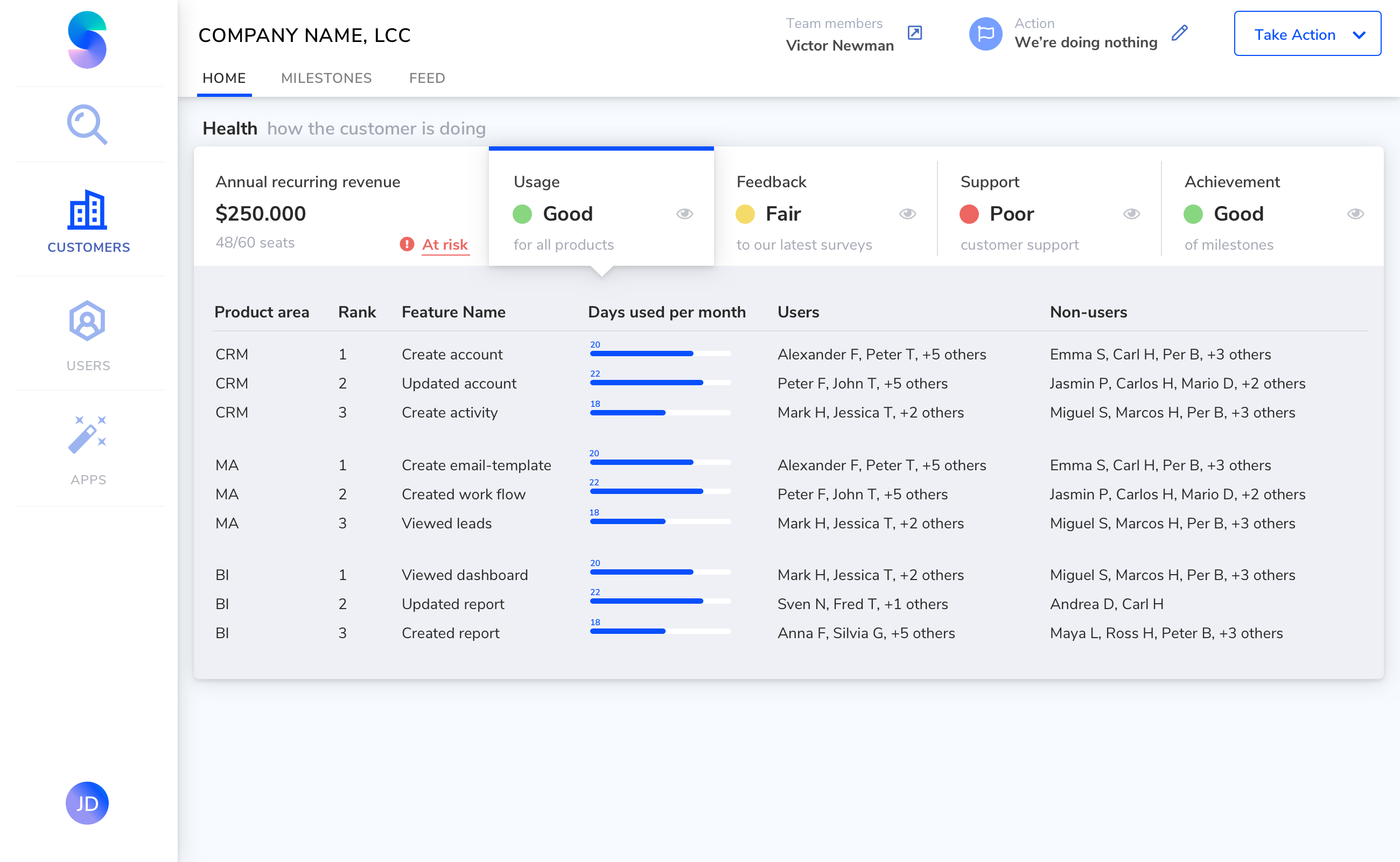
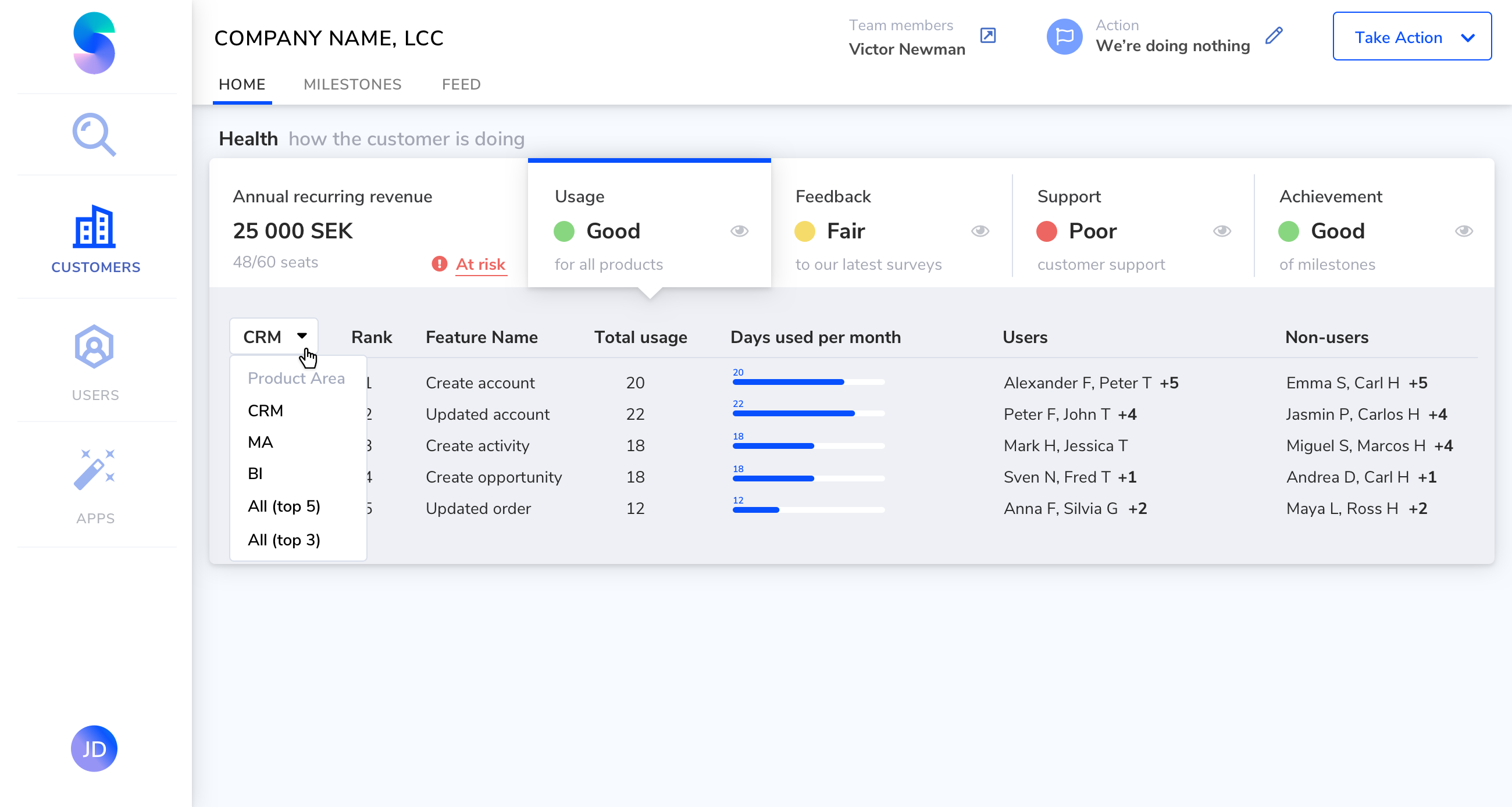
Health indicators with trend context — not only showing “good / ok / bad” status, but also a micro-trend for the past months to highlight early signals. (A stable “OK” score with a downward trend is more concerning than an “OK” score trending upward.)
-
Traffic-light-style cues for instant scanning and prioritization.
-
Collapsible modules, tabs, and layered views to keep the interface clean while allowing users to dive deeper when needed.
-
Trendlines (mini-charts) and progress visuals that surface insights without requiring users to leave the main dashboard.
Design variants and iterations
Variations to show data in usage category based on product area (the data lists can be randomly long)

Organizing the data in Feedback/survey area, where three latest surveys are shown.


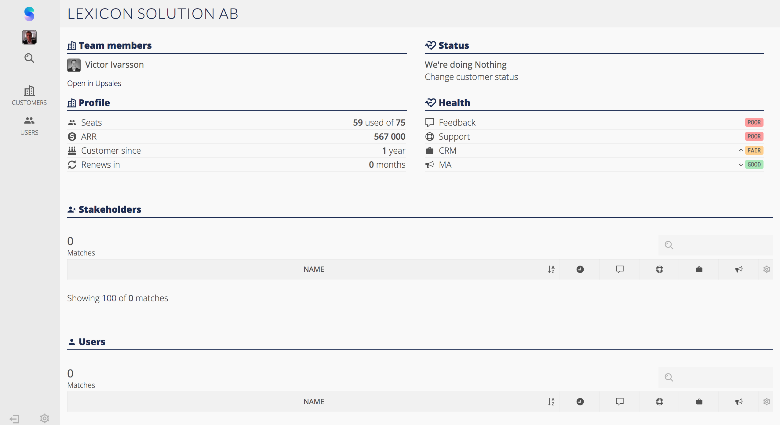
Two of alternative UI design variants that were dismissed


Almost finished designs


Outcome
The result was a flexible, data-dense interface that still felt approachable and easy to navigate. Something the team could use as a foundation for future features. The core UX structure remained almost unchanged for more than five years, which speaks to the clarity and robustness of the initial design.
Establishing a clear data architecture that still supports the product today, and creating a dashboard system that balances complexity with usability—showing the right information at the right depth, without overwhelming the user.


startdeliver.com